华丽炫酷的动画特效总能够让人心旷神怡,不能自已。艳羡之余,如果还能够探究其华丽外表下的实现逻辑,那就是百尺竿头,更上一步了。本次我们使用图片、SCSS样式以及SVG图片动画来实现“点赞”按钮的动画特效,并比较不同之处。
最简单,也最容易理解的实现方式就是使用图片。曾几何时,几乎所有前端特效都需要借助图片来完成。
实现原理很简单,通过不同的关键帧来“拼接”一段完整的动画影片,每一帧即该动画的每一个瞬间“状态”。
首先声明必要的盒子模型:
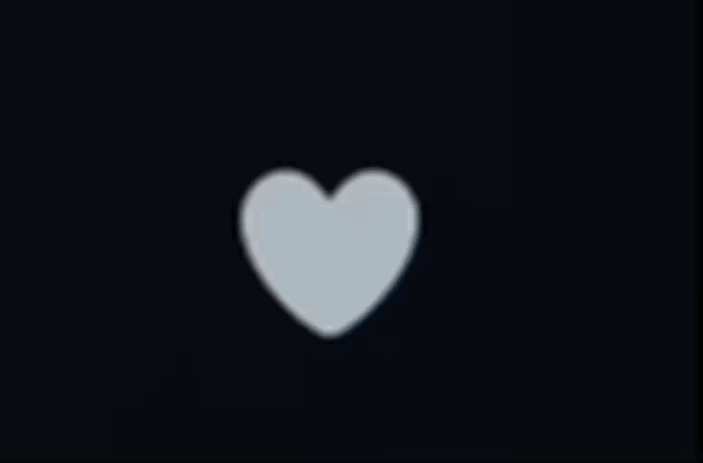
<div class="heart"></div>
复制
这里以div为例子,声明伪类对象heart。
随后通过样式对heart伪类进行控制:
.heart {
  cursor: pointer;
  height: 50px;
  width: 50px;
  background-image:url( 'https://abs.twimg.com/a/1446542199/img/t1/web_heart_animation.png');
  background-position: left;
  background-repeat:no-repeat;
  background-size:2900%;
}

.heart:hover {
  background-position:right;
}

.is_animating {
  animation: heart-burst .8s steps(28) 1;
}

@keyframes heart-burst {
  from {background-position:left;}
  to { background-position:right;}
}
复制
这里指定背景图片位置,只显示最左侧的背景元素,鼠标悬停时则只显示最右侧背景元素,然后当鼠标点击div时,触发@keyframes heart-burst动画,从左侧移动至右侧,一共进行28帧的侧移动作:

这样就完成了一段流畅的动画特效:
See the Pen <a href="https://codepen.io/v3ucom/pen/yLjNERX"> Untitled</a> by 刘悦的技术博客 (<a href="https://codepen.io/v3ucom">@v3ucom</a>) on <a href="https://codepen.io">CodePen</a>.
需要注意的是,这里需要借助JavaScript绑定单击事件,所以需要引入zepto.min.js文件
https://cdnjs.cloudflare.com/ajax/libs/zepto/1.2.0/zepto.min.js
复制
通过zepto.min.js库就可以很方便的操作页面节点:
$(".heart").on('click touchstart', function(){
  $(this).toggleClass('is_animating');
});

$(".heart").on('animationend', function(){
  $(this).toggleClass('is_animating');
});
复制
逻辑是单击事件触发动画,动画执行过程中再次点击则移除动画效果。
此种方式依赖多帧背景图、CSS动画以及JavaScript事件绑定,显然成本有些高,同时多帧图片平铺导致体积过大,也会占用系统带宽,得不偿失。
使用纯CSS样式也可以完成这样的特效,但CSS3原生语法太过复杂,这里我们使用SCSS语法,SCSS是 CSS3的超集,在保证兼容性的前提下,允许使用变量、 嵌套、 混合、导入等特性, 在编写逻辑复杂的CSS代码时,可以简化逻辑,提高CSS的代码可读性。
首先还是创建基本盒子模型:
<input id="toggle-heart" type="checkbox"/>
<label for="toggle-heart">❤</label>
复制
这里通过复选框和标签元素来控制点赞按钮的状态。
随后编写SCSS逻辑:
$bubble-d: 4.5rem; // bubble diameter
$bubble-r: .5*$bubble-d; // bubble-radius

@mixin bubble($ext) {
  transform: scale(1);
  border-color: #cc8ef5;
  border-width: $ext;
}

body {
  display: flex;
  justify-content: center;
  margin: 0;
  height: 100vh;
}

[id='toggle-heart'] {
  position: absolute;
  left: -100vw;

  &:checked + label {
    color: #e2264d;
    will-change: font-size;
    animation: heart 1s cubic-bezier(.17, .89, .32, 1.49);

    &:before, &:after {
      animation: inherit;
      animation-timing-function: cubic-bezier(.21, .61, .35, 1);
    }

    &:before {
      will-change: transform, border-width, border-color;
      animation-name: bubble;
    }
  }
}

[for='toggle-heart'] {
  align-self: center;
  position: relative;
  color: #aab8c2;
  font-size: 2em;
  cursor: pointer;

  &:before, &:after {
    position: absolute;
    z-index: -1;
    top: 50%; left: 50%;
    border-radius: 50%;
    content: '';
  }

  &:before {
    box-sizing: border-box;
    margin: -$bubble-r;
    border: solid $bubble-r #e2264d;
    width: $bubble-d; height: $bubble-d;
    transform: scale(0);
  }
}

@keyframes heart {
  0%, 17.5% { font-size: 0; }
}

@keyframes bubble {
  15% { @include bubble($bubble-r); }
  30%, 100% { @include bubble(0); }
}
复制
这里首先将复选框按钮移出界面,随后定义bubble对象,这里bubble指的是点击后膨胀的紫色(#cc8ef5)泡泡,直径是4.5rem,并且圆角修饰:$bubble-r: .5*$bubble-d
随后通过id选择器toggle-heart状态判断元素状态,触发heart和bubble动画,在一秒内动态的改变heart元素以及bubble元素的位置、大小以及边框透明度,从而完成动态特效。
接着添加烟花特效:
body {
  display: flex;
  justify-content: center;
  margin: 0;
  height: 100vh;
  background: linear-gradient(135deg, #121721, #000);
  font: 1em verdana, sans-serif;
}

[id='toggle-heart'] {
  position: absolute;
  left: -100vw;
}
[id='toggle-heart']:checked + label {
  color: #e2264d;
  filter: none;
  will-change: font-size;
  -webkit-animation: heart 1s cubic-bezier(0.17, 0.89, 0.32, 1.49);
          animation: heart 1s cubic-bezier(0.17, 0.89, 0.32, 1.49);
}
[id='toggle-heart']:checked + label:before, [id='toggle-heart']:checked + label:after {
  -webkit-animation: inherit;
          animation: inherit;
  -webkit-animation-timing-function: ease-out;
          animation-timing-function: ease-out;
}
[id='toggle-heart']:checked + label:before {
  will-change: transform, border-width, border-color;
  -webkit-animation-name: bubble;
          animation-name: bubble;
}
[id='toggle-heart']:checked + label:after {
  will-change: opacity, box-shadow;
  -webkit-animation-name: sparkles;
          animation-name: sparkles;
}
[id='toggle-heart']:focus + label {
  text-shadow: 0 0 3px white,  0 1px 1px white, 0 -1px 1px white,  1px 0 1px white, -1px 0 1px white;
}

[for='toggle-heart'] {
  align-self: center;
  position: relative;
  color: #888;
  font-size: 2em;
  filter: grayscale(1);
  -webkit-user-select: none;
     -moz-user-select: none;
      -ms-user-select: none;
          user-select: none;
  cursor: pointer;
}
[for='toggle-heart']:before, [for='toggle-heart']:after {
  position: absolute;
  z-index: -1;
  top: 50%;
  left: 50%;
  border-radius: 50%;
  content: '';
}
[for='toggle-heart']:before {
  box-sizing: border-box;
  margin: -2.25rem;
  border: solid 2.25rem #e2264d;
  width: 4.5rem;
  height: 4.5rem;
  transform: scale(0);
}
[for='toggle-heart']:after {
  margin: -0.1875rem;
  width: 0.375rem;
  height: 0.375rem;
  box-shadow: 0.32476rem -3rem 0 -0.1875rem #ff8080, -0.32476rem -2.625rem 0 -0.1875rem #ffed80, 2.54798rem -1.61656rem 0 -0.1875rem #ffed80, 1.84982rem -1.89057rem 0 -0.1875rem #a4ff80, 2.85252rem 0.98418rem 0 -0.1875rem #a4ff80, 2.63145rem 0.2675rem 0 -0.1875rem #80ffc8, 1.00905rem 2.84381rem 0 -0.1875rem #80ffc8, 1.43154rem 2.22414rem 0 -0.1875rem #80c8ff, -1.59425rem 2.562rem 0 -0.1875rem #80c8ff, -0.84635rem 2.50595rem 0 -0.1875rem #a480ff, -2.99705rem 0.35095rem 0 -0.1875rem #a480ff, -2.48692rem 0.90073rem 0 -0.1875rem #ff80ed, -2.14301rem -2.12438rem 0 -0.1875rem #ff80ed, -2.25479rem -1.38275rem 0 -0.1875rem #ff8080;
}

@-webkit-keyframes heart {
  0%, 17.5% {
    font-size: 0;
  }
}

@keyframes heart {
  0%, 17.5% {
    font-size: 0;
  }
}
@-webkit-keyframes bubble {
  15% {
    transform: scale(1);
    border-color: #cc8ef5;
    border-width: 2.25rem;
  }
  30%, 100% {
    transform: scale(1);
    border-color: #cc8ef5;
    border-width: 0;
  }
}
@keyframes bubble {
  15% {
    transform: scale(1);
    border-color: #cc8ef5;
    border-width: 2.25rem;
  }
  30%, 100% {
    transform: scale(1);
    border-color: #cc8ef5;
    border-width: 0;
  }
}
@-webkit-keyframes sparkles {
  0%, 20% {
    opacity: 0;
  }
  25% {
    opacity: 1;
    box-shadow: 0.32476rem -2.4375rem 0 0rem #ff8080, -0.32476rem -2.0625rem 0 0rem #ffed80, 2.1082rem -1.26585rem 0 0rem #ffed80, 1.41004rem -1.53985rem 0 0rem #a4ff80, 2.30412rem 0.85901rem 0 0rem #a4ff80, 2.08305rem 0.14233rem 0 0rem #80ffc8, 0.76499rem 2.33702rem 0 0rem #80ffc8, 1.18748rem 1.71734rem 0 0rem #80c8ff, -1.35019rem 2.0552rem 0 0rem #80c8ff, -0.60229rem 1.99916rem 0 0rem #a480ff, -2.44865rem 0.22578rem 0 0rem #a480ff, -1.93852rem 0.77557rem 0 0rem #ff80ed, -1.70323rem -1.77366rem 0 0rem #ff80ed, -1.81501rem -1.03204rem 0 0rem #ff8080;
  }
}
@keyframes sparkles {
  0%, 20% {
    opacity: 0;
  }
  25% {
    opacity: 1;
    box-shadow: 0.32476rem -2.4375rem 0 0rem #ff8080, -0.32476rem -2.0625rem 0 0rem #ffed80, 2.1082rem -1.26585rem 0 0rem #ffed80, 1.41004rem -1.53985rem 0 0rem #a4ff80, 2.30412rem 0.85901rem 0 0rem #a4ff80, 2.08305rem 0.14233rem 0 0rem #80ffc8, 0.76499rem 2.33702rem 0 0rem #80ffc8, 1.18748rem 1.71734rem 0 0rem #80c8ff, -1.35019rem 2.0552rem 0 0rem #80c8ff, -0.60229rem 1.99916rem 0 0rem #a480ff, -2.44865rem 0.22578rem 0 0rem #a480ff, -1.93852rem 0.77557rem 0 0rem #ff80ed, -1.70323rem -1.77366rem 0 0rem #ff80ed, -1.81501rem -1.03204rem 0 0rem #ff8080;
  }
}
复制
新增sparkles对象,通过动态的控制元素的彩色阴影来表现点击后的烟花动态效果:
See the Pen <a href="https://codepen.io/v3ucom/pen/eYrNLWY"> Untitled</a> by 刘悦的技术博客 (<a href="https://codepen.io/v3ucom">@v3ucom</a>) on <a href="https://codepen.io">CodePen</a>.
这里为了增加效果对比度,将背景设置为深色,同时为点赞按钮增加亮色边框:
[id='toggle-heart']:focus + label {
  text-shadow:
    0 0 3px #fff,
    0 1px 1px #fff, 0 -1px 1px #fff,
    1px 0 1px #fff, -1px 0 1px #fff;
}
复制
大体上,利用transform属性控制元素的绝对定位、颜色、边框以及盒子模型阴影来完成此种特效,带宽资源占用层面,明显比图片更具优势。
SVG是矢量图形,不受像素的影响,从而使得它在不同的平台或者媒体下表现出的兼容性更好,与此同时,SVG对动画的支持较好,其DOM结构可以被其特定语法或者CSS控制,从而轻松的实现动画效果。
首先依然声明盒子模型:
<label class="like">
  <input type="checkbox"/>
  <div class="hearth"/>
</label>
复制
随后定义样式:
:root {
  --size: 100px;
  --frames: 62;
}

html {
  background-color: #15202B;
  min-height: 100vh;
  display: flex;
  justify-content: center;
  align-items: center;
  user-select: none;
}

input {
  display: none;
}

.like {
  display: block;
  width: var(--size);
  height: var(--size);
  cursor: pointer;
  border-radius: 999px;
  overflow: visible;
  -webkit-tap-highlight-color: rgba(0, 0, 0, 0);
  -webkit-tap-highlight-color: transparent;
}

.hearth {
  background-image: url('https://assets.codepen.io/23500/Hashflag-AppleEvent.svg');
  background-size: calc(var(--size) * var(--frames)) var(--size);
  background-repeat: no-repeat;
  background-position-x: calc(var(--size) * (var(--frames) * -1 + 2));
  background-position-y: calc(var(--size) * 0.02);
  width: var(--size);
  height: var(--size);
}

input:checked + .hearth {
  animation: like 1s steps(calc(var(--frames) - 3));
  animation-fill-mode: forwards;
}

@keyframes like {
  0% {
    background-position-x: 0;
  }
  100% {
    background-position-x: calc(var(--size) * (var(--frames) * -1 + 3));
  }
}

@media (hover: hover) {
  .like:hover {
    background-color: #E1255E15;
    .hearth {
      background-position-x: calc(var(--size) * (var(--frames) * -1 + 1));
    }
  }
}
复制
和普通图片如出一辙,通过background-image来控制背景SVG图片的顺序,对背景的横坐标进行侧移动画操作,只不过帧数提高到62帧:
See the Pen <a href="https://codepen.io/v3ucom/pen/MWGwXPv"> Untitled</a> by 刘悦的技术博客 (<a href="https://codepen.io/v3ucom">@v3ucom</a>) on <a href="https://codepen.io">CodePen</a>.
可以看到这里通过input:checked状态就可以触发@keyframes like横移动画,并不需要单独撰写JavaScript逻辑。
三种动画特效实现方式各有千秋,但从可维护性以及成本控制角度上看,SCSS显然是最优解。