马上就要过年了,看着我这毫无生气的博客,感觉有点亏待它。博客过年,马上安排!
本篇部分知识基于上两篇博客博客园主题修改分享和博客园主题修改分享 - 脚本篇。

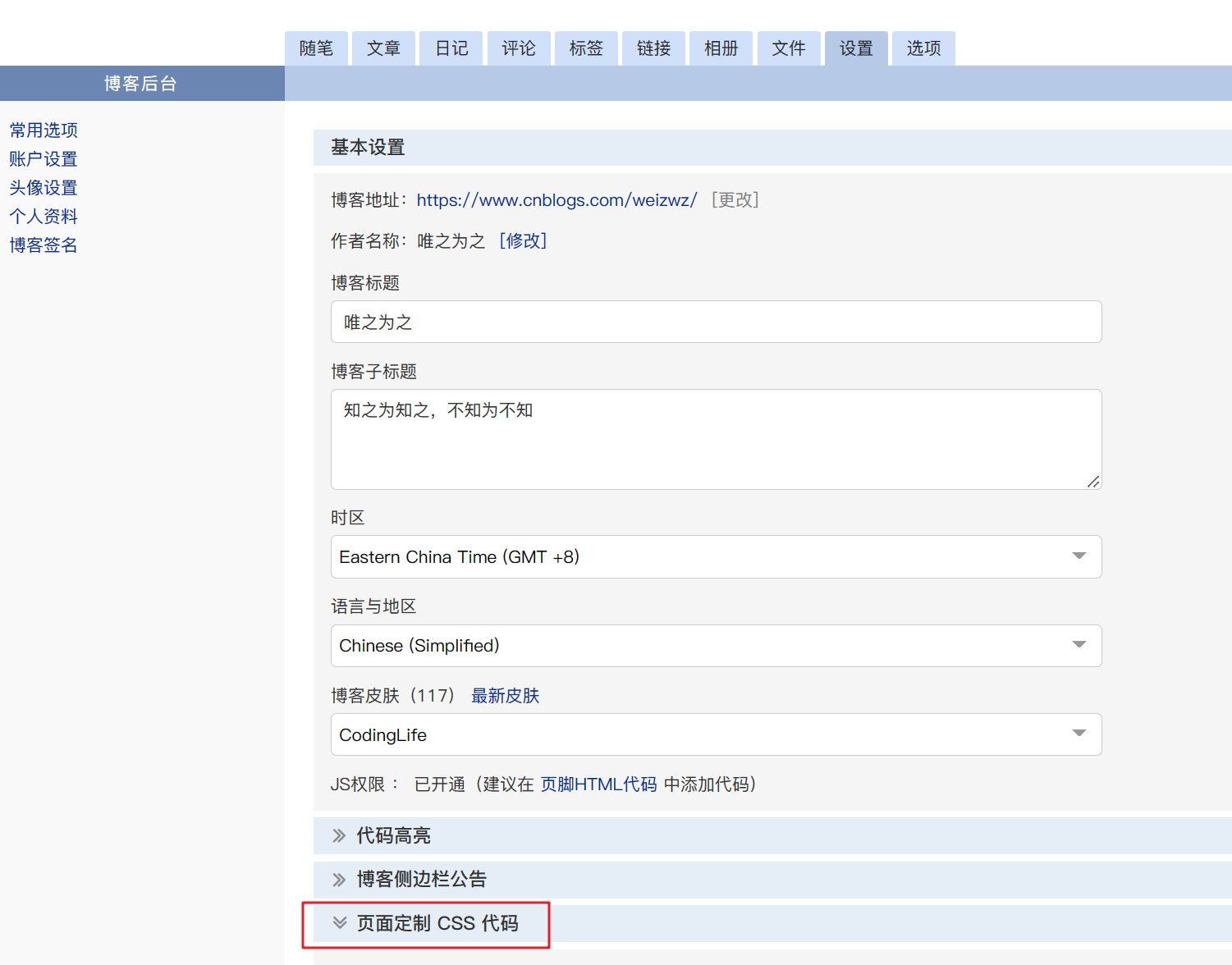
主要是通过css3的变量设置,统一博客界面的颜色。
:root {
    --bg: #f5f7f9;
    /* --main: #169fe6;
    --hover: #45bcf9; */
    --main: #ff0000;
    --hover: #fb5050;
}
复制
修改原来的色调为红色,过完年后可复原。
修改其他主体颜色,统一设置为主题色。
/*首页修改*/
#navigator {
    background-color: var(--main);
    border: none;
}
#profile_block a {
    color: var(--main);
}
/* 分页 */
#nav_next_page a {
    background-color: var(--hover);
}
.pager {
    color: var(--main);
}
复制如上,修改的地方为博客园设置的页面定制CSS代码。
下面附上所有代码:
提示:以下代码基于主题
CondingLife修改,非此主题者,请自行修改代码内对应颜色即可。
:root {
    --bg: #f5f7f9;
    /* --main: #169fe6;
    --hover: #45bcf9; */
    --main: #ff0000;
    --hover: #fb5050;
}
body {
    min-height: 100%;
    background: var(--bg);
}
a:hover {
    text-decoration: none;
}
a:-webkit-any-link {
    color: inherit;
}
/*最大宽修改*/
#navList {
    width: 1400px;
}
#main {
    max-width: 1400px;
}
#mainContent {
    flex: 0 1 1080px;
    max-width: 1080px;
}
#sideBar {
    margin: 0 0 0 20px;
}
/*首页修改*/
#navigator {
    background-color: var(--main);
    border: none;
}
#navList a:hover {
    background: linear-gradient(to bottom, #ffffff, #f0eef5);
    color: var(--main);
    height: 40px;
    line-height: 40px;
    margin-top: 10px;
    border-radius: 5px;
}
#profile_block a {
    color: var(--main);
}
#profile_block a:hover {
    color: var(--hover);
    border-bottom-color: var(--hover);
}
#blogTitle {
    display: none;
}
#navList a:link {
    text-shadow: 3px 3px 3px var(--hover);
}
.day {
    border-radius: 10px;
    margin-bottom: 20px;
}
.day:hover {
    border-color: var(--hover);
}
.day:hover .postSeparator {
    border-color: var(--hover);
}
#profile_block {
    border-radius: 0 0 10px 10px;
}
#sideBarMain > div,
#blog-sidecolumn > div > div {
    background: var(--bg);
}
/* 分页 */
#nav_next_page a {
    background-color: var(--hover);
}
.pager {
    color: var(--main);
}
.topicListFooter .pager a, .topicListFooter .pager span {
    color: var(--main);
}
.topicListFooter .pager a:hover, .topicListFooter .pager span {
    background-color: var(--hover);
}
/* 封面图片 */
.desc_img {
    margin: 5px;
    cursor: pointer;
    border-radius: 8px;
    border: solid 1px #ffffff;
    box-shadow: 0px 0px 4px 0px rgb(7, 17, 27, 0.1);
}
.desc_img:hover {
    box-shadow: 0px 0px 4px 0px rgb(7, 17, 27, 0.3);
}
/*右侧日历*/
#sideBarMain > div#blog-calendar {
    padding: 10px;
    background: #fff;
    border-radius: 10px;
    border: 1px solid #dedede;
}
#blogCalendar a:link,
.postCon a:link,
a.c_b_p_desc_readmore {
    color: var(--main);
}
#blogCalendar a:hover,
a.c_b_p_desc_readmore {
    color: var(--hover);
}
/*无日历时去间距*/
#blog-news {
    margin-bottom: 0;
}
/*右侧卡片*/
.sidebar-block {
    background-color: #f0eef5;
}
.sidebar-block h3 {
    background-color: var(--main);
    border-color: var(--main);
}
.catListView {
    background: #f0eef5;
    border-radius: 10px;
    overflow: hidden;
}
#blog-news,
#sidebar_search_box,
.sidebar-block > div > ul,
.sidebar-block > ul,
.catListView > div {
    background: #ffffff;
    border-radius: 0 0 10px 10px;
}
/*标签*/
.sidebar-block ul li {
    padding: 10px 10px 10px 20px;
}
.sidebar-block ul li a:hover {
    color: var(--hover);
    border-bottom: none;
}
#blog-sidecolumn > div#sidebar_toptags > div > ul,
#blog-sidecolumn > div > div#sidebar_postcategory > ul {
    display: flex;
    flex-wrap: wrap;
    padding: 5px 10px;
}
#sidebar_toptags ul li,
#sidebar_postcategory ul li {
    padding: 5px;
    border: none;
}
#sidebar_toptags ul li:hover,
#sidebar_postcategory ul li:hover {
    background: #fff;
    cursor: inherit;
}
#sidebar_toptags ul li a,
#sidebar_postcategory ul li a {
    padding: 3px 10px;
    line-height: 1.5;
    background: #f0eef5;
    border-radius: 3px;
    color: var(--main);
}
#sidebar_toptags ul li a:hover,
#sidebar_postcategory ul li a:hover {
    color: #ffffff;
    cursor: pointer;
    background: var(--hover);
    border-bottom: none;
}
#widget_my_google,
.sidebar-block ul {
    border-radius: 0 0 10px 10px;
}
.catListTitle {
    background-color: var(--main);
    border-color: var(--main);
    border-radius: 10px 10px 0 0;
}
/*页脚*/
#footer {
    background: var(--main);
    display: flex;
    justify-content: center;
    color: #fff;
}
#poweredby {
    margin-left: 100px;
}
/*正文*/
.dayTitle {
    background-color: var(--main);
}
.dayTitle:hover {
    background-color: var(--hover);
}
.postTitle a:link {
    color: #555;
}
.postTitle a:hover {
    color: var(--hover);
    text-decoration: none;
}
#topics,
#comment_form_container,
.under-post-card {
    border-radius: 10px;
}
#cnblogs_post_body a,
#cnblogs_post_body a:link {
    text-decoration: none;
    color: var(--main);
}
#cnblogs_post_body a:hover {
    color: var(--hover);
}
#cnblogs_post_body p a:hover,
#cnblogs_post_body ol li a:hover,
#cnblogs_post_body ul li a:hover {
    border-bottom: none;
}
/* 隐藏推荐 */
#under_post_card1,
#under_post_card2 {
    display: none;
}
/*markdown*/
.hljs {
    background: #f6f8fa;
}
#topics .postTitle {
    font-weight: bold;
    border-bottom: 1px double rgba(0,0,0,.1);
    padding-bottom: 10px;
}
#cnblogs_post_body h2 {
    padding-bottom: 0.5rem;
    border-bottom: 1px double rgba(0,0,0,.1);
}
.cnblogs-markdown :not(pre,div,td)>code,
.blogpost-body :not(pre,div,td)>code {
    font-family: source-code-pro, Menlo, Monaco, Consolas, "Courier New", monospace;
    margin: 0;
}
.cnblogs-markdown h1>code, .cnblogs-markdown h2>code,
.blogpost-body h1>code, .blogpost-body h2>code {
    font-size: inherit;
}
#topics .postBody blockquote {
    border-left-width: 3px;
    color: #555;
}
#topics .postBody blockquote p {
    color: #555;
}
#topics .postBody blockquote {
    margin: 0 0 20px;
    padding: 8px 10px 8px 14px;
    border-radius: 3px 0 0 3px;
    border-left: none;
    background-color: #e8f5ff;
    position: relative;
}
#topics .postBody blockquote::after {
    content: '';
    display: inline-block;;
    position: absolute;
    top: 0;
    left: 0;
    height: 100%;
    width: 4px;
    background: var(--hover);;
    border-radius: 3px 0 0 3px;
}
/*评论*/
.comment_textarea {
    max-width: inherit;
}
/*标签页*/
#myposts .PostList,
.entrylistItem {
    border-radius: 10px;
    margin-top: 20px !important;
}
#myposts {
    margin-left: 0;
}
/*分类页*/
.entrylistPosttitle a:hover {
    color: var(--hover);
}
/*版权页*/
.language-copyright {
    display: none !important;
}
#copyrightWeizwz {
    font-family: -apple-system, BlinkMacSystemFont, 'Segoe UI', 'Helvetica Neue', Lato, Roboto, 'PingFang SC', 'Microsoft YaHei', sans-serif;
    position: relative;
    margin: 30px 0 10px !important;
    padding: 10px 16px !important;
    border: 1px solid #eee;
    border-radius: 4px;
    color: #4c4948;
}
#copyrightWeizwz:hover {
    box-shadow: 0 0 8px 0 rgb(232, 237, 250, .6), 0 2px 4px 0 rgb(232, 237, 250, .6)
}
#copyrightWeizwz::before {
    position: absolute;
    top: 10px;
    right: 10px;
    background: var(--hover);
    content: '';
    display: inline-block;
    width: 20px;
    height: 20px;
    border-radius: 50%;
}
#copyrightWeizwz::after {
    position: absolute;
    top: 8px;
    right: 17px;
    color: #fff;
    content: 'C';
    font-size: 13px;
    font-weight: bold;
}
#copyrightWeizwz .post-copyright-meta {
    color: var(--hover);
    font-weight: bold;
}
#copyrightWeizwz .post-copyright-info {
    padding-left: 6px;
}
#copyrightWeizwz .post-copyright-info > a {
    color: #99a9bf;
    text-decoration: underline;
}
#copyrightWeizwz .post-copyright-info > a:hover {
    color: var(--hover);
    text-decoration: none;
}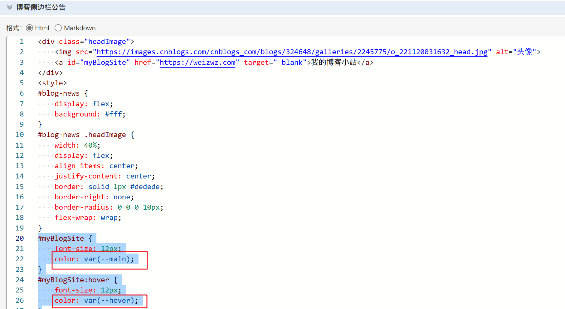
复制如果您之前对博客侧边栏公告也有修改的话,也需要修改颜色为主题色,如下示例,请自行修改
欢度春节的灯笼纯CSS样式,需要在页首HTML代码里新增代码。
代码如下:
<style>
  :root {
    --lantern-bg: rgba(255, 0, 0, .8);
    --lantern-text-color: #ffc14e;
    --lantern-line-color: #ffa500;
  }
  .lantern-box {
    position: fixed;
    top: -10px;
    right: -20px;
    max-width: 200px;
    z-index: 1999;
  }
  .lantern-box1 {
    top: -20px;
    right: 60px;
  }
  .lantern-box2 {
    top: 0px;
    right: 140px;
  }
  .lantern-box3 {
    top: -10px;
    right: 220px;
  }

  .lantern-box1 .lantern,
  .lantern-box3 .lantern{
    -webkit-animation: swing 5s infinite ease-in-out;
    animation: swing 5s infinite ease-in-out;
    box-shadow: -5px 5px 30px 4px rgba(252, 144, 61, 1);
  }

  .lantern {
    position: relative;
    width: 120px;
    height: 90px;
    margin: 50px;
    background: var(--lantern-bg);
    border-radius: 50% 50%;
    -webkit-transform-origin: 50% -100px;
    -webkit-animation: swing 3s infinite ease-in-out;
    animation: swing 3s infinite ease-in-out;
    box-shadow: -5px 5px 50px 4px rgba(250, 108, 0, 1);
  }

  .lantern-main {
    width: 95px;
    height: 90px;
    margin: 12px 8px 8px 10px;
    border-radius: 50% 50%;
    border: 2px solid var(--lantern-line-color);
  }

  .lantern-rect {
    width: 45px;
    height: 90px;
    background: #d8000f;
    background: rgba(216, 0, 15, 0.1);
    margin: -4px 8px 8px 26px;
    border-radius: 50% 50%;
    border: 2px solid var(--lantern-line-color);
  }

  .lantern-line {
    position: absolute;
    top: -60px;
    left: 60px;
    width: 2px;
    height: 60px;
    background: var(--lantern-line-color);
  }

  .lantern-tassel-top {
    position: relative;
    width: 5px;
    height: 20px;
    margin: -5px 0 0 59px;
    -webkit-animation: swing 4s infinite ease-in-out;
    -webkit-transform-origin: 50% -45px;
    background: var(--lantern-line-color);
    border-radius: 0 0 5px 5px;
  }

  .lantern-tassel-middle {
    position: absolute;
    top: 14px;
    left: -2px;
    width: 10px;
    height: 10px;
    background: #dc8f03;
    border-radius: 50%;
  }

  .lantern-tassel-bottom {
    position: absolute;
    top: 18px;
    left: -2px;
    width: 10px;
    height: 35px;
    background: var(--lantern-line-color);
    border-radius: 0 0 0 5px;
  }

  .lantern:before {
    position: absolute;
    top: -7px;
    left: 29px;
    height: 12px;
    width: 60px;
    content: " ";
    display: block;
    z-index: 1999;
    border-radius: 5px 5px 0 0;
    border: solid 1px #dc8f03;
    background: var(--lantern-line-color);
    background: linear-gradient(to right, #ffa500, #ffc14e, #ffa500, #ffc14e, #ffa500);
  }

  .lantern:after {
    position: absolute;
    bottom: -7px;
    left: 10px;
    height: 12px;
    width: 60px;
    content: " ";
    display: block;
    margin-left: 20px;
    border-radius: 0 0 5px 5px;
    border: solid 1px #dc8f03;
    background: var(--lantern-line-color);
    background: linear-gradient(to right, #ffa500, #ffc14e, #ffa500, #ffc14e, #ffa500);
  }

  .lantern-text {
    font-family: 华文行楷, 楷体, Arial, Lucida Grande, Tahoma, sans-serif;
    font-size: 2.8rem;
    color: var(--lantern-text-color);
    font-weight: bold;
    line-height: 90px;
    text-align: center;
  }

  .night .lantern-text,
  .night .lantern-box {
    background: transparent !important;
  }

  @keyframes swing {
    0% {
      transform: rotate(-10deg)
    }

    50% {
      transform: rotate(10deg)
    }

    100% {
      transform: rotate(-10deg)
    }
  }

  @-moz-keyframes swing {
    0% {
      -moz-transform: rotate(-10deg)
    }

    50% {
      -moz-transform: rotate(10deg)
    }

    100% {
      -moz-transform: rotate(-10deg)
    }
  }

  @-webkit-keyframes swing {
    0% {
      -webkit-transform: rotate(-10deg)
    }

    50% {
      -webkit-transform: rotate(10deg)
    }

    100% {
      -webkit-transform: rotate(-10deg)
    }
  }
</style>
<!-- 灯笼 节 -->
<div class="lantern-box">
    <div class="lantern">
        <div class="lantern-line"></div>
        <div class="lantern-main">
        <div class="lantern-rect">
            <div class="lantern-text">节</div>
        </div>
        </div>
        <div class="lantern-tassel lantern-tassel-top">
        <div class="lantern-tassel-bottom"></div>
        <div class="lantern-tassel-middle"></div>
        </div>
    </div>
</div>
<!-- 灯笼 春 -->
<div class="lantern-box lantern-box1">
    <div class="lantern">
        <div class="lantern-line"></div>
        <div class="lantern-main">
        <div class="lantern-rect">
            <div class="lantern-text">春</div>
        </div>
        </div>
        <div class="lantern-tassel lantern-tassel-top">
        <div class="lantern-tassel-bottom"></div>
        <div class="lantern-tassel-middle"></div>
        </div>
    </div>
</div>
<!-- 灯笼 度 -->
<div class="lantern-box lantern-box2">
    <div class="lantern">
        <div class="lantern-line"></div>
        <div class="lantern-main">
        <div class="lantern-rect">
            <div class="lantern-text">度</div>
        </div>
        </div>
        <div class="lantern-tassel lantern-tassel-top">
        <div class="lantern-tassel-bottom"></div>
        <div class="lantern-tassel-middle"></div>
        </div>
    </div>
</div>
<!-- 灯笼 欢 -->
<div class="lantern-box lantern-box3">
    <div class="lantern">
        <div class="lantern-line"></div>
        <div class="lantern-main">
        <div class="lantern-rect">
            <div class="lantern-text">欢</div>
        </div>
        </div>
        <div class="lantern-tassel lantern-tassel-top">
        <div class="lantern-tassel-bottom"></div>
        <div class="lantern-tassel-middle"></div>
        </div>
    </div>
</div>
复制灯笼的位置可自行修改,调整.lantern-box1-4的top和right属性即可。如果你想让灯笼置左,删除right属性,设置left即可。
让博客和你一起过年,祝大家新年快乐!